I've addressed in the past a particular dichotomy: teaching (the responsibility of the teacher) and learning (the responsibility of the student.) I want to address here another dichotomy: What is happening in the student's brain versus what is happening in the student's mind.
Thanks to the work of modern neuroscience, what is happening in a human brain is better understood now more than ever. But of course, what we once could easily understand or picture (say, literally, "pouring information or knowledge into a brain") is now replaced with an accumulation of small, neurochemical details gleaned from many studies and investigations. These small details can be stitched together into a coherent picture, and this is work that is current, ongoing, and available.
What is happening in a student's mind is harder to pin down. But what is a mind? How does it work versus how a brain works? Is there really such a thing as a mind? Is learning a product of the mind or of the brain?
These are all good questions, for which I certainly don't have answers. What I can say is that you cannot somehow examine a student's brain to determine what the student thinks. Even the student doesn't necessarily know what he thinks. Plenty of times I think I know something only to discover I really don't. And other times I have come to realize, to my surprise, that I somehow do know something.
Perhaps, more to the point, we could simply ask a student, "What are you thinking right now?" I frequently find myself on the verge of telling a student some piece of information - I am the teacher, the subject expert, after all! But instead I catch myself and try to ask a question instead, especially if it's more important that I have a better idea of what the student is thinking. And why would I want to know what a student is thinking? Because it would, I hope, help me understand what she has learned. Her answer could lead to more questions from me, as I attempt to fully understand what she knows.
Have you ever been subject to an oral exam, i.e. viva voce? When I was an undergrad, I participated in an observational astronomy program with a small number of fellow students. The program was off-campus since it required being near an observatory. At the end of the semester, the professor decided that an oral exam would be an appropriate final exam for each of us in our small group.
The way an exam viva voce works is that a question is asked, and your answer determines what the next question will be. The professor pokes and probes in this way to find out what you know and, more importantly, what you don't know. When it appears that what you know or can figure out has been exhausted, the professor moves on to another question. From the student's point of view, each series of questions ends in failure. It's exhausting, and when you're done you feel like you've failed every question. Of course none of us failed, we all just reached the limits of what we knew and understood. The professor, being the expert, had a much more realistic idea of what we knew, what we should have known, and where we could go next.
What has a student learned? And learned as opposed to what a student has memorized, or looked up (or asked AI). Do the examinations we give students really probe their thinking and give us an idea of what students know?
In the school where I taught this past year, it seemed that all the students had already figured out AI. One student, who I suspected had used AI surreptitiously during a quiz, was upset that I was calling him on it. "But you want us to give you the right answers, right?"

Who's Responsible for What?
In the classroom, a teacher teaches, and a student learns. But who is responsible for what? I'll give you the short answer: the teacher is responsible for teaching, the student is responsible for learning. This sounds pretty straightforward, but consider the implications.
The teacher teaches. This is an act of performance (see here), and the teacher is definitely responsible for the nature and content of his or her instruction. The classroom environment will reflect what the teacher does, what materials the teacher uses, what rules are set, but the teacher cannot control what students learn.
The student is responsible for learning. Whether and what the student learns is up to the student. If a student doesn't want to learn, he won't. If the student learns incorrectly, that's her doing. It might not be her fault however. Students learn different things at different rates, often in spite of themselves. Their brains are not yet mature, especially those frontal lobes. Yet the teacher's responsibility is to be aware of who is learning what, and to make appropriate adjustments. But for good or for ill, learning is up to the student.
An important implication of this fact is this: you cannot judge teaching by testing what it is students have learned. Every teacher knows this. Every teacher contents him or herself with the understanding that most students do the best they can most of the time. Every teacher adjusts what they are doing to what the students seem able to do. What would be the point of doing otherwise?
Since you can't honestly judge teaching by testing the students, you also cannot compare teachers against each other, even if they presumably teach the same class or material. Teachers will always adjust to the students they have, which will create differences from class to class, from course to course, in spite of attempts to standardize the curriculum or the grading policies.
But the difficulty for administrators, who need to understand what is happening in classrooms, is the time it takes to actually visit classes, watch what is going on, sit down and talk with teachers, and so on. In my current school, I get visited by administrators (whether they have ever taught or not) two, maybe three times in a year, for about 15 or 20 minutes per visit.
I can only imagine that the desire to standardize what happens in classrooms must stem from the sheer impossibility of their responsibility, which is to monitor everything happening in the building.
The teacher teaches. This is an act of performance (see here), and the teacher is definitely responsible for the nature and content of his or her instruction. The classroom environment will reflect what the teacher does, what materials the teacher uses, what rules are set, but the teacher cannot control what students learn.
The student is responsible for learning. Whether and what the student learns is up to the student. If a student doesn't want to learn, he won't. If the student learns incorrectly, that's her doing. It might not be her fault however. Students learn different things at different rates, often in spite of themselves. Their brains are not yet mature, especially those frontal lobes. Yet the teacher's responsibility is to be aware of who is learning what, and to make appropriate adjustments. But for good or for ill, learning is up to the student.
An important implication of this fact is this: you cannot judge teaching by testing what it is students have learned. Every teacher knows this. Every teacher contents him or herself with the understanding that most students do the best they can most of the time. Every teacher adjusts what they are doing to what the students seem able to do. What would be the point of doing otherwise?
Since you can't honestly judge teaching by testing the students, you also cannot compare teachers against each other, even if they presumably teach the same class or material. Teachers will always adjust to the students they have, which will create differences from class to class, from course to course, in spite of attempts to standardize the curriculum or the grading policies.
But the difficulty for administrators, who need to understand what is happening in classrooms, is the time it takes to actually visit classes, watch what is going on, sit down and talk with teachers, and so on. In my current school, I get visited by administrators (whether they have ever taught or not) two, maybe three times in a year, for about 15 or 20 minutes per visit.
I can only imagine that the desire to standardize what happens in classrooms must stem from the sheer impossibility of their responsibility, which is to monitor everything happening in the building.
Why Stagecraft?
Teaching in a classroom is a kind of performance. All teachers know this, but some are uncomfortable with the word "performance." For me to invoke stagecraft as a pillar of my framework thus requires some explaining.
The anxiety around the word "performance" stems from a misunderstanding; performance means entertainment, and entertaining is the opposite of boring. Students hate boredom and like entertainment, so if you're not entertaining enough as a teacher, the students will hate you. But if you are nothing but entertaining, you are not doing your job. So . . . you can't win.
First, performance does not mean entertainment. Nor does it mean "sage on the stage." Performance means taking physical charge of a roomful of people in a way that is planned, practiced, aware, and proactive. This is sometimes referred to as "running the room." To perform well is to do it gracefully, with poise and presence, humor and seriousness, using both training and improvisation. The performer is acutely aware of the audience, and knows how to read and work with the audience's emotional energy.
Second, all teachers perform in the classroom - it's just a matter of whether the performance is deliberate or haphazard, the teacher conscious or unconscious. Wouldn't you prefer to understand and develop the physical and emotional impact you have on your class, and put that impact to work in your teaching?
The anxiety around the word "performance" stems from a misunderstanding; performance means entertainment, and entertaining is the opposite of boring. Students hate boredom and like entertainment, so if you're not entertaining enough as a teacher, the students will hate you. But if you are nothing but entertaining, you are not doing your job. So . . . you can't win.
First, performance does not mean entertainment. Nor does it mean "sage on the stage." Performance means taking physical charge of a roomful of people in a way that is planned, practiced, aware, and proactive. This is sometimes referred to as "running the room." To perform well is to do it gracefully, with poise and presence, humor and seriousness, using both training and improvisation. The performer is acutely aware of the audience, and knows how to read and work with the audience's emotional energy.
Second, all teachers perform in the classroom - it's just a matter of whether the performance is deliberate or haphazard, the teacher conscious or unconscious. Wouldn't you prefer to understand and develop the physical and emotional impact you have on your class, and put that impact to work in your teaching?
Teaching and its Predicaments
By World War II teaching already was America's most investigated profession, the object of many studies, much criticism, and repeated proposals for reform. The postwar explosion of higher education, the consequent growth of the social sciences, and increasing efforts at school reform fueled a huge growth in research on education, and more investigations and reform proposals followed. Investigators scrutinized teachers' education, the conditions of their work, the unions they joined, the salaries they earned, how and why they made decisions, and many related subjects.
As I worked on this project, I read many of these studies, but I gradually saw that even in this accelerating blizzard of research there was little about the work of teaching itself. Researchers probed the occupation from dozens of angles and produced boxcar loads of studies, but only a few asked the rudimentary questions: What sort of an endeavor is teaching? What kinds of problems must teachers solve, and how do they solve them? And what would it take to solve them in ways that promote ambitious teaching and learning?
Cohen, David K (2011). Teaching and its Predicaments, Harvard University Press, Cambridge MA
The Triumph of Efficiency over Effectiveness
Teaching and learning — especially in the US — takes place behind the doors of millions of self-contained classrooms, and this drives reformers crazy. Historians of education have long documented how often past efforts at school reform bounced off the classroom door, thus buffering the process of teaching and learning within from outside influence.
This local autonomy, which makes education annoyingly inefficient in the eye of policymakers, is essential in the effort to make education effective. Teaching is not a delivery system for academic content but a fiendishly complex form of professional practice that seeks to induce students to learn in the absence of any efficient mechanism for insuring that they will do so. Students only learn when and what they choose to learn. The classroom art is in luring them into making the choice the teacher is aiming for. And this means that teachers need to have the flexibility to adapt their teaching approaches to the peculiarities of the group of students they find before them and also to the differences in individual students in the class. The variables that shape this process are legion: school subject, age, sex, class, ethnicity, community, home life, health, hunger, time of day, day of year, weather, and state of mind — to name just a few. The accountability movement disrupts this teaching and learning process by forcing teachers and students to focus entirely on learning particular subject matter at a particular level measured by the high-stakes test. It deliberately ties the teacher’s hands, compelling the same pedagogy for every classroom — and that pedagogy is teaching to the test.
Teaching to the test is an efficiency mechanism masquerading as effectiveness. One problem is that it runs smack into Goodhart’s Law: Once a measure becomes a target, it is no longer a valid measure. Initially a student’s test score may capture something about the amount of specific subject matter that student has accumulated. But once teachers, schools, school systems, and whole countries make raising test scores the object of schooling, the scores become ends in themselves. Everyone learns quickly how to game the system in order to raise scores with a minimum of real learning.
Another problem with the accountability approach is that it radically narrows the aims of education. Instead of seeing education as an effort to gain a broad array of skills and forms of knowledge, to explore interests, experience personal growth, become a good citizen and a productive worker, it focuses learning on a tiny subset of school subjects that bear only a marginal relationship to these broader goals.
And perhaps most depressing of all, accountability systems are the most efficient tool ever devised to destroy a student’s interest in learning. It makes school the world's deadliest job — where the best strategy is to phone it in, in order to keep school from grinding you down into a grain of sand in the desert of test prep. In education, as in many other things, efficiency is the death of effectiveness.
Excerpted from https://davidlabaree.com/2024/07/25/the-triumph-of-efficiency-over-effectiveness-in-both-public-health-and-public-schooling/
Should Teachers Know the Basic Science of How Children Learn?
This quotation is from an article published by the American Federation of Teachers (AFT) in the summer of 2019, part of a series called "Ask the Cognitive Scientist." The scientist is Daniel T. Willingham, a cognitive scientist dedicated to passing on and explaining the results of cognitive research to school teachers.
(Willingham's website is a treasure trove of useful science. In particular, click on his articles.)
The article goes on to address the sometimes confusing intersection of cognitive science and teaching, the difference between empirical generalizations and theoretical statements in science, and why teachers should focus on empirical generalizations for application to their teaching.
If you would like examples of empirical generalizations, there is a table of articles by Willingham focusing on specific generalizations - click here.
In addition to the article, there is also a huge AFT sidebar packed with useful information and a lot of links to other resources. Here's a blog post of mine about one of those resources.
(Willingham's website is a treasure trove of useful science. In particular, click on his articles.)
Scientific knowledge can influence educational practice in more than one way. Sometimes the applications are overt, as when scientific descriptions of how children learn offer new ideas for instructional methods. For example, researchers have described the learning benefits of spacing out practice1 and some educators have sought to incorporate that finding into their classrooms.
Science can also influence education through the use of scientific methods to evaluate the effectiveness of different educational practices. Scientists have a lot of experience designing experiments and can offer useful techniques to help decide whether, for example, two reading programs differ in how much they motivate children to read independently.
* * *
An educator’s practice is, of course, influenced by her beliefs about what children are like. Teachers try to tune their practice to what they believe to be children’s nature, in the perfectly reasonable belief that teaching will be more successful if it accounts for the way children learn. These beliefs influence not only planning but also teachers’ in-the-moment reactions and responses when something unexpected happens in the classroom. Furthermore, beliefs influence our receptiveness to new ideas.2 When a vendor offers a new product, for example, or an administrator suggests a new classroom practice, teachers evaluate it in light of their beliefs about children.
Scientific findings provide one (but obviously not the only) source of information contributing to educators’ beliefs about the nature of children. . . . Here I want to make a different point: some statements concerning children’s learning are perfectly sound scientifically but should not influence educational decisions. That includes some statements that seem like they ought to have a direct bearing on classrooms.
1. N. Cepeda et al., “Distributed Practice in Verbal Recall Tasks: A Review and Quantitative Synthesis,” Psychological Bulletin 132, no. 3 (2006): 354–380.
2. R. Nickerson, “Confirmation Bias: A Ubiquitous Phenomenon in Many Guises,” Review of General Psychology 2, no. 2 (1998): 175–220.
The article goes on to address the sometimes confusing intersection of cognitive science and teaching, the difference between empirical generalizations and theoretical statements in science, and why teachers should focus on empirical generalizations for application to their teaching.
If you would like examples of empirical generalizations, there is a table of articles by Willingham focusing on specific generalizations - click here.
In addition to the article, there is also a huge AFT sidebar packed with useful information and a lot of links to other resources. Here's a blog post of mine about one of those resources.
The Learning Scientists
Here's a recommendation: in an earlier posting, (Should Teachers Know the Basic Science of How Children Learn?), I mentioned the American Federation of Teachers, who publish the "Ask the Cognitive Scientist" series.
Among the multitude of other resources available on their site is a website called The Learning Scientists.org. The AFT describes it as "a website written by four cognitive psychologists interested in education." The Learning Scientists describe themselves as "Making scientific research on learning more accessible to students, teachers, and other educators." Yes, there are four main writers, but quite a collection of collaborators and scientists as well.
This is a very up-to-date, diverse, accessible site worth visiting and exploring if you are a teacher interested in cognitive science.
Which you should be. Honest. Give it a look.

Among the multitude of other resources available on their site is a website called The Learning Scientists.org. The AFT describes it as "a website written by four cognitive psychologists interested in education." The Learning Scientists describe themselves as "Making scientific research on learning more accessible to students, teachers, and other educators." Yes, there are four main writers, but quite a collection of collaborators and scientists as well.
This is a very up-to-date, diverse, accessible site worth visiting and exploring if you are a teacher interested in cognitive science.
Which you should be. Honest. Give it a look.
The Collision that Formed the Moon
I was poking around YouTube looking at videos about where the Earth's Moon came from. The currently accepted theory is called the Giant Impact Hypothesis. Though details differ, the main idea is that a smaller planet collided with the early Earth, and the Moon arose from the resulting debris. This hypothesis continues to be tweaked to this day, and other hypotheses continue to be proposed, all because details remain in the existing evidence that are unaccounted for. It's both delightful and a little surprising that the research is still quite active.
I was looking for an up-to-date simulation of the Giant Impact as opposed to an artist's interpretation. I was hoping that, given the current state of computer simulations, there might be something amazing available. There are older videos on YouTube about the Giant Impact which use pretty impressive artist's interpretations. But artists will sometimes take liberties with the physics if it makes the animation more engaging. What I wanted my students to see was a computer simulation that is based on a mathematical model that is allowed to run unedited and unimpeded. Like this:
This is clearly a simulation, probably run on a supercomputer. There is no question that the imagery is based on a model. You can even see the individual elements, almost like little blobs, for which calculations are being run to determine the next state of each blob.
Eventually I came across this video:
I loved this simulation. You can see the resemblance to the one above. The video is obviously a clip from a longer video, but no credit was given. So I hunted and hunted until I found the source:
This is a longer video featuring the work of Dr Robin M Canup, who is also narrating. Dr Canup is associated with the Southwest Research Institute in Boulder CO, where she has used supercomputer simulations to create and build her Moon-formation models. She has also participated in the production of "data-driven cinematic animations," like the one in the video above.
This video is a preview of a portion of a Fulldome Planetarium show called "The Birth of Planet Earth," produced by Spitz Creative Media, the Advanced Visualization Lab of the National Center for Supercomputing Applications, and Thomas Lucas Productions, Inc., set for release in 2019. (More details in this report and in this video).
As nice as this 2018 mini-documentary is, I still wanted just the simulation, so I edited it out of the video as its own clip and stripped the audio. I thought about adding some kind of background music, or using music from the original video. Dr Canup's narration was pretty good, but just not lined up with the simulation clip. I really liked the idea of the female narrator also being the physicist whose work this was - something I'd be proud to point out to my students. So I copied the audio of her narration (with the music), added it to my clip, tweaked the timing a bit, faded the ends, and then had to stall the beginning of the clip to fit the whole audio. I built an elaborate fade-in with the visuals so the stall would feel more natural. It also allows the viewer a chance to focus on Dr Canup before the visual effects of the collision take over. Here is the final result:
A final note: Dr Canup appears in an earlier, similar production created for the History channel in 2007. Here's one version of it on YouTube.
I was looking for an up-to-date simulation of the Giant Impact as opposed to an artist's interpretation. I was hoping that, given the current state of computer simulations, there might be something amazing available. There are older videos on YouTube about the Giant Impact which use pretty impressive artist's interpretations. But artists will sometimes take liberties with the physics if it makes the animation more engaging. What I wanted my students to see was a computer simulation that is based on a mathematical model that is allowed to run unedited and unimpeded. Like this:
This is clearly a simulation, probably run on a supercomputer. There is no question that the imagery is based on a model. You can even see the individual elements, almost like little blobs, for which calculations are being run to determine the next state of each blob.
Eventually I came across this video:
I loved this simulation. You can see the resemblance to the one above. The video is obviously a clip from a longer video, but no credit was given. So I hunted and hunted until I found the source:
This is a longer video featuring the work of Dr Robin M Canup, who is also narrating. Dr Canup is associated with the Southwest Research Institute in Boulder CO, where she has used supercomputer simulations to create and build her Moon-formation models. She has also participated in the production of "data-driven cinematic animations," like the one in the video above.
This video is a preview of a portion of a Fulldome Planetarium show called "The Birth of Planet Earth," produced by Spitz Creative Media, the Advanced Visualization Lab of the National Center for Supercomputing Applications, and Thomas Lucas Productions, Inc., set for release in 2019. (More details in this report and in this video).
As nice as this 2018 mini-documentary is, I still wanted just the simulation, so I edited it out of the video as its own clip and stripped the audio. I thought about adding some kind of background music, or using music from the original video. Dr Canup's narration was pretty good, but just not lined up with the simulation clip. I really liked the idea of the female narrator also being the physicist whose work this was - something I'd be proud to point out to my students. So I copied the audio of her narration (with the music), added it to my clip, tweaked the timing a bit, faded the ends, and then had to stall the beginning of the clip to fit the whole audio. I built an elaborate fade-in with the visuals so the stall would feel more natural. It also allows the viewer a chance to focus on Dr Canup before the visual effects of the collision take over. Here is the final result:
A final note: Dr Canup appears in an earlier, similar production created for the History channel in 2007. Here's one version of it on YouTube.
Stacking all the Planets
You've probably come across this idea that all the planets could fit between Earth and the Moon. The usual representation looks like this image I found on Google:

It turns out, it's not entirely true. Here's a good article about this, published in Slate a few years ago. The planets can fit, but you have to make a lot of adjustments.
What got me thinking about this recently was an amazing video I found on YouTube by yeti dynamics (here's YD's channel). He has made a number of what-if? astronomy videos. The video that astonished me was a simulation of the Earth-Moon system with all the planets fitted inside the Moon's orbit. The view is from the Earth's surface, and the speed is greatly increased. It makes your head swim. But there's something spell-binding about these gigantic orbs circling so close to the Earth (that is, if it doesn't give you motion sickness, like it does for my wife).
What really astonished me is how much work it must have taken YD to construct this. He created his assets (images of planets, background landscape, 3-D modeling), programmed the animation, and created the video using Blender, 3dsMax, and Natron.
I was contemplating this Herculean task when I realized that I already had an application designed for astronomical simulation. It's called Celestia, and I've worked with it for years. It comes pre-loaded with visual assets (and you can simply add more), and the animation programming is done with script files, also included, which are easily modified. Celestia's basic job is to model the known universe, but you can also create alternative worlds, alien star systems, and break the laws of physics.
So I made a copy of Celestia's basic solar system script, and started modifying. I didn't want to disturb our solar system, so I chose a new Sun - 18 Scorpio, a star about the same size and composition as our own Sun. Then I started modifying the planetary data. First, I created a spreadsheet to help me work out the distances and orbital times (also called periods) for the planets. This is where I had to work out the adjustments I mentioned above to fit (or stack) the planets. Here's the list of adjustments:
I took that last point from YD's video. I did try putting the planets in their traditional order, but the visual result was not impressive. This was an inspired move by YD.
Data was obtained from NASA's Planetary Fact Sheets.
Here's a screenshot of my spreadsheet:

This is a 7½-minute video of the final simulation recorded from Celestia. I've positioned the viewpoint in geosynchronous orbit about 8 miles above the Earth's surface, facing northeast, a 50-degree field of view, with the rate of time speeded up a thousandfold.
In case you download and install Celestia, here is a link for downloading a version of the script file I created. You can put it in Celestia's Extras folder, and modify as you wish.
I have shown this simulation to several people. It's quite mesmerizing. As another physics teacher told me, if this is what the sky looked like, we'd never get anything done. My students like it when I project it onto the big whiteboard in my classroom. I'm not sure there is much educational value to it, though. Students seem to recognize that it's "not real," but do understand that the planets would look like that up close. They don't get right away that it's speeded up, and the idea that the planets have been fitted into the Moon's orbit is pretty abstract. Not many people even spot the Moon. Hardly anyone realizes that there's no gravity in the simulation. With gravity, the whole system would collapse pretty quickly. There's no way this could have formed naturally.
But interesting questions do come up, and students like to guess which planet is which, and they sometimes just watch, like you would watch fish in a fish tank. Lankshear & Knobel, in their book New Literacies, describe the role of the teacher as elicitive. In this case, I suggest that, as a teacher, I am being evocative. And maybe that's OK.

It turns out, it's not entirely true. Here's a good article about this, published in Slate a few years ago. The planets can fit, but you have to make a lot of adjustments.
What got me thinking about this recently was an amazing video I found on YouTube by yeti dynamics (here's YD's channel). He has made a number of what-if? astronomy videos. The video that astonished me was a simulation of the Earth-Moon system with all the planets fitted inside the Moon's orbit. The view is from the Earth's surface, and the speed is greatly increased. It makes your head swim. But there's something spell-binding about these gigantic orbs circling so close to the Earth (that is, if it doesn't give you motion sickness, like it does for my wife).
What really astonished me is how much work it must have taken YD to construct this. He created his assets (images of planets, background landscape, 3-D modeling), programmed the animation, and created the video using Blender, 3dsMax, and Natron.
I was contemplating this Herculean task when I realized that I already had an application designed for astronomical simulation. It's called Celestia, and I've worked with it for years. It comes pre-loaded with visual assets (and you can simply add more), and the animation programming is done with script files, also included, which are easily modified. Celestia's basic job is to model the known universe, but you can also create alternative worlds, alien star systems, and break the laws of physics.
So I made a copy of Celestia's basic solar system script, and started modifying. I didn't want to disturb our solar system, so I chose a new Sun - 18 Scorpio, a star about the same size and composition as our own Sun. Then I started modifying the planetary data. First, I created a spreadsheet to help me work out the distances and orbital times (also called periods) for the planets. This is where I had to work out the adjustments I mentioned above to fit (or stack) the planets. Here's the list of adjustments:
- The Moon is permanently at apogee (greatest distance from Earth)
- All planetary orbits are circular (zero eccentricity)
- All planets are perfectly spherical (mean radius)
- Pluto is included even though it's not a planet anymore (it fit!)
- All bodies are evenly spaced (1666 km gap between bodies)
- Saturn is tilted 45 degrees so the rings won't slice through other planets
- Planets are not in their traditional order, but in order by size.
I took that last point from YD's video. I did try putting the planets in their traditional order, but the visual result was not impressive. This was an inspired move by YD.
Data was obtained from NASA's Planetary Fact Sheets.
Here's a screenshot of my spreadsheet:
This is a 7½-minute video of the final simulation recorded from Celestia. I've positioned the viewpoint in geosynchronous orbit about 8 miles above the Earth's surface, facing northeast, a 50-degree field of view, with the rate of time speeded up a thousandfold.
In case you download and install Celestia, here is a link for downloading a version of the script file I created. You can put it in Celestia's Extras folder, and modify as you wish.
I have shown this simulation to several people. It's quite mesmerizing. As another physics teacher told me, if this is what the sky looked like, we'd never get anything done. My students like it when I project it onto the big whiteboard in my classroom. I'm not sure there is much educational value to it, though. Students seem to recognize that it's "not real," but do understand that the planets would look like that up close. They don't get right away that it's speeded up, and the idea that the planets have been fitted into the Moon's orbit is pretty abstract. Not many people even spot the Moon. Hardly anyone realizes that there's no gravity in the simulation. With gravity, the whole system would collapse pretty quickly. There's no way this could have formed naturally.
But interesting questions do come up, and students like to guess which planet is which, and they sometimes just watch, like you would watch fish in a fish tank. Lankshear & Knobel, in their book New Literacies, describe the role of the teacher as elicitive. In this case, I suggest that, as a teacher, I am being evocative. And maybe that's OK.
Using Desmos for Physics (Part II)
Here is a variation on the Desmos graph I created in my last post. This graph is intended less as a demonstration and more as a student exercise. The five dots are moveable, and define the position curve. Then by clicking on the Speed circle at line 6 in the side panel, students can see the speed curve, which is the slope of the position curve. This is useful for students learning to read slope by focusing on key inflection points and trends.
Here's the link to this Desmos project: https://www.desmos.com/calculator/vo4kxervvi
You can minimize the panel on the left (click the "<< " symbol). You can also manipulate the right panel to change the viewpoint.
Using Desmos for Physics (Part I)
Here's the link to this Desmos project: https://www.desmos.com/calculator/vo4kxervvi
You can minimize the panel on the left (click the "<< " symbol). You can also manipulate the right panel to change the viewpoint.
Using Desmos for Physics (Part I)
Using Desmos for Physics (Part I)
When I discovered Desmos, I knew that both I and my students would love it. Desmos has been called an online graphing calculator, which is literally true, but a description that barely captures the possibilities. I have come to see Desmos as a programmable simulator, using a programming language called math.
I could see right away that there would be two ways for me to use Desmos in the physics classroom. First, I could create interactive, animated graphs that students could manipulate and play with. Second, students could, with a little scaffolding, create their own animated graphs. These graphs could demonstrate basic graphing concepts, such as finding the slope of a curve, or building a distribution curve for a set of data. They could also demonstrate basic mathematical relationships among various physical quantities.
But first I had to learn how to use Desmos. The fastest way for me was to find existing graphs that I was interested in, study how they had been built, and then modify and adapt them. When I inevitably "broke" a graph, I was able to find enough information online to figure out where I had gone wrong. It was really fun, and the immediate response by Desmos to any changes was addictive. I also quickly realized that my math skills are pretty rusty. I've done a lot of programming, and you can get away with some sloppiness and inelegance, but straight-out math is pretty unforgiving. If you need to brush up on your math skills, Desmos is the most fun way I can think of to do so.
This is my first Desmos project: https://www.desmos.com/calculator/fm6yuykclr
You can minimize the panel on the left (click the "<< " symbol). You can also manipulate the right panel to change the viewpoint.
Go to line 6 on the left panel (Graph of Slope) and click the circle.
This graph is based on a graph I've already had the students draw and analyze. Students commonly confuse position (the height of the curve) with speed (the slope of the curve), so the more tools for visualizing the better. In this case, I'm using Desmos as a demonstration tool, but it's pretty easy to have all the students call up the graph on a laptop and show them things they can change. I try to have them guess what might happen with a given change, and then check their guesses. Each instance of the graph is separate from the other instances, so students can modify the graphs without disturbing my original or each other. They also do not need to create an account, or even log in. Hit the link and play!
Using Desmos for Physics (Part II)
I could see right away that there would be two ways for me to use Desmos in the physics classroom. First, I could create interactive, animated graphs that students could manipulate and play with. Second, students could, with a little scaffolding, create their own animated graphs. These graphs could demonstrate basic graphing concepts, such as finding the slope of a curve, or building a distribution curve for a set of data. They could also demonstrate basic mathematical relationships among various physical quantities.
But first I had to learn how to use Desmos. The fastest way for me was to find existing graphs that I was interested in, study how they had been built, and then modify and adapt them. When I inevitably "broke" a graph, I was able to find enough information online to figure out where I had gone wrong. It was really fun, and the immediate response by Desmos to any changes was addictive. I also quickly realized that my math skills are pretty rusty. I've done a lot of programming, and you can get away with some sloppiness and inelegance, but straight-out math is pretty unforgiving. If you need to brush up on your math skills, Desmos is the most fun way I can think of to do so.
This is my first Desmos project: https://www.desmos.com/calculator/fm6yuykclr
You can minimize the panel on the left (click the "<< " symbol). You can also manipulate the right panel to change the viewpoint.
Go to line 6 on the left panel (Graph of Slope) and click the circle.
This graph is based on a graph I've already had the students draw and analyze. Students commonly confuse position (the height of the curve) with speed (the slope of the curve), so the more tools for visualizing the better. In this case, I'm using Desmos as a demonstration tool, but it's pretty easy to have all the students call up the graph on a laptop and show them things they can change. I try to have them guess what might happen with a given change, and then check their guesses. Each instance of the graph is separate from the other instances, so students can modify the graphs without disturbing my original or each other. They also do not need to create an account, or even log in. Hit the link and play!
Using Desmos for Physics (Part II)
New Physics Curriculum
I was tasked this year with redesigning the physics curriculum at my school. Our state (MA) just upgraded their framework, so we needed to re-align. For the last decade, the state's framework was nothing more than a shopping cart of physics topics. There wasn't even an attempt to distinguish topics from concepts. The state assessment required students to have key vocabulary memorized, and to know how to pick out the right equation and apply it correctly to word problems. And that was about it.
My physics team has only three members. For good or for ill, we are all well-versed in the old state framework and assessment. The new framework is mostly based on the Next Generation Science Standards, so it’s quite different. I was excited about the change, because I think the NGSS is a worthy approach. But it’s very different from the old approach, and I wanted the team to have the time and opportunity to adapt. The new curriculum I wrote is organized in a way that looks similar to the old curriculum, but introduces and adapts the new framework language. The team already has a strong bias toward hands-on, project-based, team-oriented classwork. I wanted the physics team to continue moving in that direction, but to shift their conception of this project-based classwork from demonstration-of-topic to phenomenon-model-interaction.
To help our team, perhaps other science teams, and even our supervisors, to better understand the NGSS framework, I created a concept diagram. The diagram is not based directly on the NGSS framework, but is instead a representation of the new curriculum I wrote. I think of the new curriculum as a particular instance of the NGSS framework.

The old curriculum thinking was topic first, application second. The new curriculum flips that around to phenomenon first, model second. The basic interaction is that the phenomenon informs the model, and the model makes predictions about the phenomenon. We choose an anchor phenomenon that is sufficiently complex, has relevance to the lives of the students, and is interesting or engaging. As an aid in exploring this phenomenon, simpler and perhaps more accessible related phenomena are introduced.
The model is related to other models, largely through shared concepts such as force and energy. Through these core concepts, students can develop a picture of physics as a consistent viewpoint and approach to understanding the world, rather than merely a collection of topics. The model is represented and expressed in many ways. These multiple representations give students multiple pathways for exploring the relationship between model and phenomenon.
Finally, in keeping with the idea that learning comes from doing, I include a summary of what students could do as they explore the phenomenon-model relationship. This list is broadly in line with the goals stated in the standards of the new state framework.
My physics team has only three members. For good or for ill, we are all well-versed in the old state framework and assessment. The new framework is mostly based on the Next Generation Science Standards, so it’s quite different. I was excited about the change, because I think the NGSS is a worthy approach. But it’s very different from the old approach, and I wanted the team to have the time and opportunity to adapt. The new curriculum I wrote is organized in a way that looks similar to the old curriculum, but introduces and adapts the new framework language. The team already has a strong bias toward hands-on, project-based, team-oriented classwork. I wanted the physics team to continue moving in that direction, but to shift their conception of this project-based classwork from demonstration-of-topic to phenomenon-model-interaction.
To help our team, perhaps other science teams, and even our supervisors, to better understand the NGSS framework, I created a concept diagram. The diagram is not based directly on the NGSS framework, but is instead a representation of the new curriculum I wrote. I think of the new curriculum as a particular instance of the NGSS framework.

The old curriculum thinking was topic first, application second. The new curriculum flips that around to phenomenon first, model second. The basic interaction is that the phenomenon informs the model, and the model makes predictions about the phenomenon. We choose an anchor phenomenon that is sufficiently complex, has relevance to the lives of the students, and is interesting or engaging. As an aid in exploring this phenomenon, simpler and perhaps more accessible related phenomena are introduced.
The model is related to other models, largely through shared concepts such as force and energy. Through these core concepts, students can develop a picture of physics as a consistent viewpoint and approach to understanding the world, rather than merely a collection of topics. The model is represented and expressed in many ways. These multiple representations give students multiple pathways for exploring the relationship between model and phenomenon.
Finally, in keeping with the idea that learning comes from doing, I include a summary of what students could do as they explore the phenomenon-model relationship. This list is broadly in line with the goals stated in the standards of the new state framework.
Space Junk Joyride
I don't get nearly enough chances to use Celestia in my classroom. I've loved messing around with Celestia for years, but it's the rare student who shares my enthusiasm for astronomy. In class I will use Celestia to demonstrate gravitational orbits - moons around planets, planets and comets around suns, stars orbiting stars orbiting more stars.
During one such class this past year, one of my brightest students asked me if I had heard about the time an asteroid had circled Earth three or four times and then disappeared. I encouraged her to explain further, though I was skeptical. So she whipped out her smartphone, found an animation of the event, and showed it to me. Sure enough, there it was.

The animation had specific dates, and the asteroid had a designation that I recognized as legit; J002E3. I promised the class that I would gather more information for the next class.
Wikipedia has an entry about J002E3, and in that page I found the NASA/JPL animation my student had shown me. I also found an amazing story. J002E3 was indeed first thought to be an asteroid, but later determined to be space junk, namely the third stage of the Apollo 12 Saturn V rocket launched in 1969. The rocket stage was intended to wind up in orbit around the Sun, but it didn't quite make it, and is now technically still in orbit around Earth. It's in a semi-stable orbit, though - J002E3 spends decades circling the Sun before it re-enters the Earth-Moon system, circles the Earth a half-dozen times, and gets shot back out around the Sun. Eventually it will crash into either the Earth or the Moon.
J002E3 orbited the Earth six times from the spring of 2002 until late spring of 2003, a little more than 13 months, and this is what the animation shows. I presented the animation to my students on the SmartBoard, and I knew right away that I would have to change it. The file is an animated GIF, which cannot be paused, have its speed changed, or be run in reverse. The deep blue orbital path, which shows up nicely on a computer screen, did not project brightly enough on the SmartBoard to be seen easily. The GIF's dimensions were too small. I would have to do a little editing and then turn it into a video.
Photoshop is the perfect tool for this. It will read all the frames of an animated GIF and turn them into individual layers. You can edit the layers, and then turn them back into a GIF or a video. I first changed the dimensions, doubling both the width and height. Then I changed the color of the orbit in each of the frames. This took some painstaking effort - about 80% of the work could be done very quickly, but each of the 516 frames had to be carefully checked. I exported it as an MP4 video which I posted on YouTube.
NASA link: https://cneos.jpl.nasa.gov/news/news134.html
Animation versions & credit: https://cneos.jpl.nasa.gov/doc/j002e3/
During one such class this past year, one of my brightest students asked me if I had heard about the time an asteroid had circled Earth three or four times and then disappeared. I encouraged her to explain further, though I was skeptical. So she whipped out her smartphone, found an animation of the event, and showed it to me. Sure enough, there it was.

The animation had specific dates, and the asteroid had a designation that I recognized as legit; J002E3. I promised the class that I would gather more information for the next class.
Wikipedia has an entry about J002E3, and in that page I found the NASA/JPL animation my student had shown me. I also found an amazing story. J002E3 was indeed first thought to be an asteroid, but later determined to be space junk, namely the third stage of the Apollo 12 Saturn V rocket launched in 1969. The rocket stage was intended to wind up in orbit around the Sun, but it didn't quite make it, and is now technically still in orbit around Earth. It's in a semi-stable orbit, though - J002E3 spends decades circling the Sun before it re-enters the Earth-Moon system, circles the Earth a half-dozen times, and gets shot back out around the Sun. Eventually it will crash into either the Earth or the Moon.
J002E3 orbited the Earth six times from the spring of 2002 until late spring of 2003, a little more than 13 months, and this is what the animation shows. I presented the animation to my students on the SmartBoard, and I knew right away that I would have to change it. The file is an animated GIF, which cannot be paused, have its speed changed, or be run in reverse. The deep blue orbital path, which shows up nicely on a computer screen, did not project brightly enough on the SmartBoard to be seen easily. The GIF's dimensions were too small. I would have to do a little editing and then turn it into a video.
Photoshop is the perfect tool for this. It will read all the frames of an animated GIF and turn them into individual layers. You can edit the layers, and then turn them back into a GIF or a video. I first changed the dimensions, doubling both the width and height. Then I changed the color of the orbit in each of the frames. This took some painstaking effort - about 80% of the work could be done very quickly, but each of the 516 frames had to be carefully checked. I exported it as an MP4 video which I posted on YouTube.
NASA link: https://cneos.jpl.nasa.gov/news/news134.html
Animation versions & credit: https://cneos.jpl.nasa.gov/doc/j002e3/
High (Voltage) Wire Act
My brother-in-law Peter visited last year and showed me and my wife some of his favorite short videos on YouTube. When I saw this one featuring a man inspecting high voltage lines, I knew that I would show it to my students. It's a lovely little video narrated by the electrical inspector who talks about his work, and his life, and even tells a story about how his suit is a special kind of Faraday cage.
I knew my students would find this video interesting. There are a lot of intriguing electrical details and small events that could almost go unnoticed, and which could form the basis of some interesting physics questions and demonstrations. Our technical school has an Electrical Technology shop, and students in the shop would already know about this kind of work, and would be excited to watch this and share their knowledge. This video is a perfect example of what I like to add to my instruction toolkit.
The version I first watched on YouTube was of poor quality, and there was no indication of who actually made the video. It was obviously clipped from a longer video about dangerous or exciting work. There are many copies scattered throughout YouTube, and I spent a lot of time hunting for the best and most complete version. I finally found a high-definition version of the clip. I used Filmora to clean up the beginning and the end of the audio track. I did watch other videos about high-voltage line inspectors, but this one best suited my purposes. It's calming, actually, rather than all hyped up, and you get a sense of the man rather than just a focus on the details or the danger of the job. The music sets the mood perfectly. There's a joke at the end that mostly goes over my students' heads.
I eventually discovered that the the clip is from an IMAX movie called "Straight Up: Helicopters In Action." It was produced in 2002 by SK Films for the Smithsonian National Air and Space Museum, and apparently aired as a cable TV broadcast by INHD, which later came to be called MOJO HD. I also came across a comment that it had appeared on Discovery HD.
The Electromagnetic Spectrum
A couple of years ago, when my team of physics teachers started building instruction around the topic of electromagnetic radiation, I began assembling a list of different common uses and manifestations of EM radiation. This list would provide a basis of information to use in our written instruction, as well as suggest hands-on activities, demonstrations, and labs.
I focused on uses that high-school students would be familiar with; cellphones, wi-fi and bluetooth, radar guns used to clock car speeds, microwave ovens, various remote control devices, tanning lights. My school is a technical school, so students have familiarity with other uses and devices; arc-welding, dental x-rays, high-voltage power lines, baby monitors, the mixing of colors. By focusing on what students might be familiar with, I hoped to reveal both prior knowledge and prior misunderstandings and misconceptions. A teacher could build on the prior knowledge, but more importantly would be obliged to address the misconceptions.
The list became a full table of data, with over 30 entries. It has become an object of study in itself, an exercise in the literacy of reading data tables and extracting useful information to answer questions and solve problems. This is a form of literacy familiar to our technical students, who in their shops must learn to read technical manuals full of similar tables.
The full table is shown in the window below. Depending on your browser, the window might display a thumbnail, which you should try to disable (there might be an icon along the top). You might also be able to adjust the file to fit the window.
As usual for me, the table was constructed as an Excel file, making it easy to add or change data. If you have access to Adobe Acrobat Pro, you could also edit the PDF version above. Here is the link for the Excel version, with instructions:
Excel file, with instructions
Here is a shorter and simpler version, for students not as adept at scientific notation (or SI units generally):
Finally, here's a vocabulary worksheet that I have the students work together on that is related to the simpler chart above. (I do have a more elaborate one for the chart at the top above.)
A very helpful online calculator and table: https://rechneronline.de/spectrum/
Another online converter and source of information: https://www.translatorscafe.com/unit-converter/en/frequency-wavelength/
I focused on uses that high-school students would be familiar with; cellphones, wi-fi and bluetooth, radar guns used to clock car speeds, microwave ovens, various remote control devices, tanning lights. My school is a technical school, so students have familiarity with other uses and devices; arc-welding, dental x-rays, high-voltage power lines, baby monitors, the mixing of colors. By focusing on what students might be familiar with, I hoped to reveal both prior knowledge and prior misunderstandings and misconceptions. A teacher could build on the prior knowledge, but more importantly would be obliged to address the misconceptions.
The list became a full table of data, with over 30 entries. It has become an object of study in itself, an exercise in the literacy of reading data tables and extracting useful information to answer questions and solve problems. This is a form of literacy familiar to our technical students, who in their shops must learn to read technical manuals full of similar tables.
The full table is shown in the window below. Depending on your browser, the window might display a thumbnail, which you should try to disable (there might be an icon along the top). You might also be able to adjust the file to fit the window.
As usual for me, the table was constructed as an Excel file, making it easy to add or change data. If you have access to Adobe Acrobat Pro, you could also edit the PDF version above. Here is the link for the Excel version, with instructions:
Excel file, with instructions
Here is a shorter and simpler version, for students not as adept at scientific notation (or SI units generally):
Finally, here's a vocabulary worksheet that I have the students work together on that is related to the simpler chart above. (I do have a more elaborate one for the chart at the top above.)
A very helpful online calculator and table: https://rechneronline.de/spectrum/
Another online converter and source of information: https://www.translatorscafe.com/unit-converter/en/frequency-wavelength/
The Sun in Various Wavelengths
My physics curriculum has shifted in response to our new state frameworks, and one shift has been a greater emphasis on electromagnetic radiation. I've been having fun concocting new examples and demonstrations (including an "in-house" field trip to our metal fabrication shop to experience welding).
This spring my class was having a discussion about the Sun's radiation, and how so much of what it radiates is invisible to us. They wondered what it would look like if we could see the different kinds of radiation. I explained that we can create devices or sensors that detect different wavelengths of radiation, and then construct false-color images from the information gathered. Immediately I went online and hunted for something to show them. A great resource, which I have used before, is the wonderful and painstakingly-built website called Windows to the Universe. This site is a project of the National Earth Science Teachers Association.
In particular, I went to the page entitled The Multispectral Sun, and found this animated GIF:
.gif)
I liked this concept a lot, and looked around for other examples. I found What's the Sun doing lately? and Compare Multispectral Sun Images, and lots of imagery, including this NASA composite image from the Solar Dynamics Observatory:
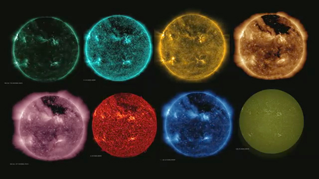
I decided to try making something of my own. My project would be a video replication of the animated GIF above, but using many more images. And I would start with the images in the NASA image above.
Here is what I wanted: a video file so playback can be controlled, a broad and representative spectrum of images, and captions with either a specific or representative wavelength indicated. I shamelessly borrowed some aspects of the animated GIF (images scaled to the same size, captions colored to match the image, images taken on the same day). Because I started with the NASA SDO chart, I needed to know what date those images were taken. A little hunting revealed July 11, 2012.
So I was off and running. I decided to stick with spectroheliograms, rather than dopplergrams or magnetograms. I searched for quite a while for solar images in various wavelengths that were taken on 7/11/12. Depending on what time and from where the image was taken, 7/10/12 images sometimes worked as well or better.
As I accumulated my images, I had to decide on wavelength units. My students didn't know about Angstroms, so I used nanometers instead. I came to realize that I could use just three units; nanometers, millimeters, and meters. Then came the laborious Photoshop work, including colorizing a couple of the images. The video was constructed and edited with Filmora. I posted the final video on YouTube.
An interesting issue is the color of the Sun as we see it. Ask anyone, what color is the Sun? Almost everyone will say "yellow," but of course it isn't, it's white, at least to our eyes (and by definition). (Please don't go out now and look at the Sun - it's bad for your eyes. But if you have a chance to look at it when it's almost completely obscured by fog or clouds, you'll see.) I found many images of yellow suns with the caption "visible light." These images were either taken through a yellow filter or they were colorized yellow because of a belief people will think it should be yellow (white light, of course, does not have a specific wavelength).
When I showed the final video to my students, they loved it. But many suggested it should have music. I was telling this to one of my fellow science teachers, and she said, "I have exactly what you need!" She owns a small, portable planetarium called Star Theater Pro, and it comes with a music CD having 15 minutes of suitably cosmic-sounding music composed by Donovan Reimer. She was right, it was perfect.
Here's the final video product:
And here's a shorter animated GIF:

Here are links for downloading the most recent versions:
MP4 Video: 4 seconds per image, with audio
MP4 Video: 4 seconds per image, no audio
MP4 Video: 3 seconds per image, no audio
Animated GIF: 2 seconds per image, continuous loop
Credits:
Radio: 0.9 m, 2.0 m - BASS2000/Nançay Radioheliograph
Microwave: 17.6 mm - Siberian Solar Radio Telescope
Microwave: 52.6 mm - Nobeyama Radioheliograph
Infrared: 1083 nm - HAO/Mauna Loa Observatory CHIP
Visible: 656 nm (Hα) - Big Bear Solar Observatory
Visible: white - NASA/SDO AIA
Visible: 393 nm (CaIIK) - Langkawi National Observatory
Ultraviolet: 170 nm through X-Ray: 9.4 nm - NASA/SDO AIA
X-Ray: 5 nm, 1.9 nm - NOAA/GOES Solar X-Ray Imager
Music - Star Theater Pro/Donovan Reimer
This spring my class was having a discussion about the Sun's radiation, and how so much of what it radiates is invisible to us. They wondered what it would look like if we could see the different kinds of radiation. I explained that we can create devices or sensors that detect different wavelengths of radiation, and then construct false-color images from the information gathered. Immediately I went online and hunted for something to show them. A great resource, which I have used before, is the wonderful and painstakingly-built website called Windows to the Universe. This site is a project of the National Earth Science Teachers Association.
In particular, I went to the page entitled The Multispectral Sun, and found this animated GIF:
I liked this concept a lot, and looked around for other examples. I found What's the Sun doing lately? and Compare Multispectral Sun Images, and lots of imagery, including this NASA composite image from the Solar Dynamics Observatory:
I decided to try making something of my own. My project would be a video replication of the animated GIF above, but using many more images. And I would start with the images in the NASA image above.
Here is what I wanted: a video file so playback can be controlled, a broad and representative spectrum of images, and captions with either a specific or representative wavelength indicated. I shamelessly borrowed some aspects of the animated GIF (images scaled to the same size, captions colored to match the image, images taken on the same day). Because I started with the NASA SDO chart, I needed to know what date those images were taken. A little hunting revealed July 11, 2012.
So I was off and running. I decided to stick with spectroheliograms, rather than dopplergrams or magnetograms. I searched for quite a while for solar images in various wavelengths that were taken on 7/11/12. Depending on what time and from where the image was taken, 7/10/12 images sometimes worked as well or better.
As I accumulated my images, I had to decide on wavelength units. My students didn't know about Angstroms, so I used nanometers instead. I came to realize that I could use just three units; nanometers, millimeters, and meters. Then came the laborious Photoshop work, including colorizing a couple of the images. The video was constructed and edited with Filmora. I posted the final video on YouTube.
An interesting issue is the color of the Sun as we see it. Ask anyone, what color is the Sun? Almost everyone will say "yellow," but of course it isn't, it's white, at least to our eyes (and by definition). (Please don't go out now and look at the Sun - it's bad for your eyes. But if you have a chance to look at it when it's almost completely obscured by fog or clouds, you'll see.) I found many images of yellow suns with the caption "visible light." These images were either taken through a yellow filter or they were colorized yellow because of a belief people will think it should be yellow (white light, of course, does not have a specific wavelength).
When I showed the final video to my students, they loved it. But many suggested it should have music. I was telling this to one of my fellow science teachers, and she said, "I have exactly what you need!" She owns a small, portable planetarium called Star Theater Pro, and it comes with a music CD having 15 minutes of suitably cosmic-sounding music composed by Donovan Reimer. She was right, it was perfect.
Here's the final video product:
And here's a shorter animated GIF:
Here are links for downloading the most recent versions:
MP4 Video: 4 seconds per image, with audio
MP4 Video: 4 seconds per image, no audio
MP4 Video: 3 seconds per image, no audio
Animated GIF: 2 seconds per image, continuous loop
Credits:
Radio: 0.9 m, 2.0 m - BASS2000/Nançay Radioheliograph
Microwave: 17.6 mm - Siberian Solar Radio Telescope
Microwave: 52.6 mm - Nobeyama Radioheliograph
Infrared: 1083 nm - HAO/Mauna Loa Observatory CHIP
Visible: 656 nm (Hα) - Big Bear Solar Observatory
Visible: white - NASA/SDO AIA
Visible: 393 nm (CaIIK) - Langkawi National Observatory
Ultraviolet: 170 nm through X-Ray: 9.4 nm - NASA/SDO AIA
X-Ray: 5 nm, 1.9 nm - NOAA/GOES Solar X-Ray Imager
Music - Star Theater Pro/Donovan Reimer
A Story About Weather and Teaching
Physics as Story
I think of physics as a kind of story. It's actually a huge collection of stories, the result of working to understand every physical phenomenon under the sun (and beyond). In the physics classroom I am therefore a storyteller, and I endeavor to help my students become better physics storytellers.
Certainly in physics there's a specialized vocabulary that can be assembled into stories, but I also think of graphs, diagrams, and even equations as kinds of story. As with any good story, there is an art and a craft to both the understanding and telling of physics stories. Physics stories just happen to be demanding in particular ways.
High school students already know how to tell many kinds of stories. I teach juniors and seniors, and they tend to tell certain kinds of stories about the events in their lives. For instance, many of them have begun driving cars, or are about to, and there is a lot of interest in and concern about driving. Some have already had scary experiences and close-calls; few have an accurate understanding of the physics of what they are doing. A natural entry point, then, is to ask them about their driving experiences. Various instructional activities give them the opportunity to refine and change their stories. If a student can tell a solid physics story, by whatever means, to whatever extent, then that student is demonstrating learned knowledge of physics.
A Worksheet as Storytelling
An instructional tool I have used for a long time is the vocabulary worksheet. You know the kind - there's a word bank, and you fill in the blanks to complete the sentences. But my worksheets have a different twist. Most of the words in the word bank are used several times. Each blank is numbered, and if a word fits the blank, it fits all the blanks with that number. This allows me to avoid writing disconnected sentences with only one or two blanks. I can write a coherent paragraph, a whole short story. Sometimes toward the end of the worksheet the sentences are mostly just blanks waiting to be filled in. The repetition of words and phrases becomes an important part of adjusting to the new vocabulary.
After everyone finishes, we read the worksheet out loud, one student per sentence. Sometimes we'll go around the room twice. If there are diagrams or equations at the bottom of the sheet, interpreting them is part of the reading. The students really enjoy the challenge, even by the end of the year after we've done two dozen or so of these. Here's one:
These worksheets can be difficult to construct. I have written an Excel spreadsheet that helps me construct them. It allows me to just write the sentences as naturally as possible, while it keeps track of the blanks and the numbering and the word bank. Normally I would share such a worksheet here, but few people understand Excel, and it's very easy to "break" an Excel file. If I ever find another, more fool-proof approach, I'll let you know!
The Story of Weather
So what about the weather? I have a few favorite physics topics, and weather is one of them. The problem with broad topics like this in the physics classroom is that students are struggling to learn the basic concepts and tools, and weather is a really complex topic. Still, whenever there is a good opportunity, I'll try to link some aspect of weather to whatever we're working on.
The topic of heat and heat exchange is central, for instance, to weather. Before students can begin to comprehend this story, they need to master some basic ideas and vocabulary about heat. In my classes, this work tends to happen toward the end of the school year. If I have a class that seems ready, and there's a bit of time in the busy end-of-year schedule, I have a special worksheet for them.
Or rather I've been planning a special worksheet for which there keeps being not enough time to finish and use. Not enough time for the last two years. This year, because I knew I had the students who could benefit from it, I really hustled to finish this special worksheet.
I started with a simple but long vocabulary worksheet which tells the story of how the interaction between the atmosphere and the sun's radiation results in a rainstorm. The worksheet is simple because there are only six words in the word bank! But there are 20 sentences. After I finished the basic worksheet, I got the idea to use diagrams of the entire heat process that would parallel the sentences. I used diagrams from NOAA's lovely tutorials on weather called JetStream. I edited the diagrams with Photoshop, and then used Adobe Acrobat Pro to assemble my worksheet.
I decided to split the page vertically and have the running vocabulary/story part on the left half and the images on the right half. I then put fill-in blanks on the diagrams which corresponded to the vocabulary. Normally my worksheets are black-and-white, but I decided to keep the images in color and to print the worksheets using a color printer. This emphasized the "special" aspect of this worksheet (and the students who got a worksheet all said "Ooooh, color!"). The worksheet is 2 pages long, below:
While the students were working on it, I looped a time-lapse video on the SmartBoard that showed a collection of rain-clouds billowing way up into the atmosphere. It was the last vocab worksheet of the year. As usual, we read it aloud once everyone was finished.
Quick Electromagnetism Demo Videos
One of my students this past year had a medical condition that required him to be out of school for an extended time. I decided to make quick little videos for him, somehow. I had already been demonstrating the devices for my students, so the devices were out and ready, and I had my explanations practiced and warmed-up. I decided to use a simple Logitech USB webcam that normally attaches to my monitor. I experimented with rigging it up in various ways and hit upon having it point straight down at a black lab tabletop. That way just my hands and the devices would be visible while my voice narrated. The webcam software kept trying to adjust for the black tabletop, over-exposing anything not black. I finally decided to leave something bright in the frame which I knew I could crop out later. This turned out to be a pretty easy way to control the exposure.
After a couple of takes, I opened the video files in my editor of choice, Filmora (worth the expense, but there's also a free option), and edited the video. I created a fade from black at the beginning and a fade to black at the end. I separated the audio track, and faded the audio as well. I went through the audio to get rid of unnecessary um's and ah's and other sounds. Sometimes I inserted a bit of video or audio from another take. It was pretty quick work. I exported the videos as MP4 files and uploaded them to YouTube. The videos are below.
After a couple of takes, I opened the video files in my editor of choice, Filmora (worth the expense, but there's also a free option), and edited the video. I created a fade from black at the beginning and a fade to black at the end. I separated the audio track, and faded the audio as well. I went through the audio to get rid of unnecessary um's and ah's and other sounds. Sometimes I inserted a bit of video or audio from another take. It was pretty quick work. I exported the videos as MP4 files and uploaded them to YouTube. The videos are below.
Notes on Radioactivity & Particle Physics
BP Tech Applied & Advanced Physics
Some notes on how we could approach teaching radioactivity/nuclear structure.
Background
The State of Massachusetts has revised its high-school science curriculum finally. But there is an orphan unit: radioactivity. I think this must be a new unit in the science curriculum, and the State first tried to add it to the Chemistry curriculum. Then to Earth Science. And finally to Physics. Where it truly is simply added, like a wart, to the front of the Physics curriculum. No attempt is made to connect it to anything else in the curriculum.
Now of course radioactivity is a proper physics topic, and the study of radioactivity led to important developments in modern physics. At BP Tech, where I teach, I always took a bit of the school year to look at basic atomic structure, knowing that students would see it again in chemistry. The problem with just tacking on radioactivity is that explaining radioactivity (as opposed to just describing it) draws you into quantum and particle physics, which could easily eat up an entire semester, or more. I spent a whole year thinking about how to present the topic without getting completely derailed from the rest of the physics curriculum. These notes explain what I came up with, on behalf of the entire physics teaching team at my school.
P.S. If you click on a diagram, you will see the original diagram (higher resolution) and you can download it.
Part I
Here is how I’ve tried to approach atomic structure in the past. After exploring the gravitational field and early into electrostatics (after introducing electric fields and electrons), I take a moment to look at a simple atomic model:

This model explains several things: the electric neutrality of atoms, the mobility of electrons, where our mass comes from. Later, when talking about electric current, I begin the discussion of how materials are constructed of atoms (or more usually molecules), and how electrons can basically hop from atom to atom. There is a net flow of electrons throughout a circuit but no single electron moves through the entire circuit (hence my distaste for the water model of electric circuits). I also take this moment to show various simulations that try to represent electrons moving through a circuit, and how they are incorrect and misleading.
Now it might be useful to discuss the residual charge (or residual electric field) of the electrons. Residual charge explains stickiness and friction and why chemical reactions happen and the unusual properties of water. Then when we get to the strong force, the idea of residual force will come into play, and the students will have already experienced the concept.
So this is as far as I have carried this in the past. We need to dig deeper in order to explain radioactivity.
Part 2
The nucleus, made up of protons and neutrons. What holds it together?

Wouldn’t the protons repel? Yes, of course, and it does happen in nature. Some atoms spit out a proton or neutron now and again. There’s your first taste of radioactivity. So there must be another force that’s really strong but has a tiny range. Call it a nuclear force, because it only operates in the nucleus, and more specifically call it the strong force.
Two issues: why the tiny range? And why does it apply to neutrons as well as protons? Let’s assume that protons and neutrons are made of something similar, and let’s call these constituent particles quarks. It turns out that protons and neutrons are made of 3 quarks each. And protons and neutrons differ by only one quark. The strong force is what holds the quarks together. Here’s a model of a proton:

The strong force that exists outside the “boundary” of the proton (or the neutron) is the residual strong force. This is what holds protons and neutrons together.
At this point, I think there is no sense in complicating this picture. You could point out that there are different kinds of quarks, but I wouldn’t even take it that far. And I definitely wouldn’t mention specific force field particles, like gluons. This will just draw you into quantum physics, and really the point here is to explain radioactivity.
Exploring the atomic nucleus is tricky (and abstract) enough – too much information will muddy the waters. We’re just building on the concept of force fields (gravity, electricity, magnetism, and now strong nuclear). If you have students who wish to pursue this on their own, here is an excellent website called The Particle Adventure:
https://particleadventure.org/
Part 3
So now we’re ready to talk about radioactivity as the result of the instability of large atomic nuclei, like those of uranium, or nuclei with too many neutrons. Basically there isn’t enough residual strong force out on the margins to hold these nuclei together.
An unstable nucleus will:
- spit out single neutrons (neutron emission)
- spit out single protons (rare)
- spit out a chunk of nucleus made of 2 protons and 2 neutrons (alpha emission)
- during these processes, the nucleus might also emit very high energy EM radiation (gamma emission)
All these emission products (particles, if you will) have a LOT of energy. If absorbed by other atoms, this energy can damage molecules and make atoms radioactive.
At this point, we are welcome to explore further anything we wish about radioactivity, including health effects or nuclear fission/fusion, or mass/energy conversion, or commercial nuclear energy, or what fuels the Sun. We have to keep it short and simple, though, because we’re not quite done.
Part 4
An unstable nucleus will also spit out – an electron! This is beta emission, and it's really weird. Why is this weird and unexpected? Well, where did the electron come from? Protons and neutrons aren’t made of electrons!
So there must be another force, another nuclear force. This one is called the weak force. The weak force is odd, though, in that it does not cause anything to happen, it allows something to happen. Here’s the something:

But there’s leftover negative charge and energy and mass. Where does it go? The weak force temporarily holds the charge, mass, and energy, and then releases it as an electron. So that’s where the beta emission comes from.
A neutrino is also emitted, but I don’t know how much you want to get into neutrinos, other than to say that they are especially tiny sub-atomic particles with no charge. They are often the result of energy converting into mass.
So here is what the full interaction looks like:

Conclusion
Ultimately all this is to say that there are only four fundamental forces in nature: gravity, electro-magnetism, and the two nuclear forces, strong and weak. And we might not ever have known about the nuclear forces if it hadn’t been for radioactivity.
Satellite Blogging
Probably the most amazing Twitter account I have ever seen is the account of an inanimate object - a space satellite, to be specific. This satellite (and its companion satellite) tweets its exploits on a daily basis. here), and it has been in space for a decade.
 The Rosetta spacecraft was designed to intercept a comet. It has spent almost all of the decade traveling out to the comet and lining itself up to join the comet in its journey toward the Sun. As I write it is in orbit around the comet and preparing to launch a small lander that will hopefully not bounce off the comet or crash into it, but instead spear itself into the surface and begin doing its science.
It's a very cute Twitter account, written as if the spacecraft itself was writing the tweets, and linking to a host of online resources - Twitter, Facebook, YouTube, blogs, websites, and webcasts. I've been an astronomy buff since I was 10 years old, so when Rosetta caught up with the comet finally this summer, I was quite excited. I'm always looking for a way to add astronomy to my physics classes.
Whenever I have a free 5 minutes or so in class, I put the Twitter feed up on the Smartboard so we can all have a look. The students feel my enthusiasm, and get pretty caught up in the excitement. They also think it's cool that I'm using Twitter and YouTube in the class. I've been doing this since the first week of school.
It's a very cute Twitter account, written as if the spacecraft itself was writing the tweets, and linking to a host of online resources - Twitter, Facebook, YouTube, blogs, websites, and webcasts. I've been an astronomy buff since I was 10 years old, so when Rosetta caught up with the comet finally this summer, I was quite excited. I'm always looking for a way to add astronomy to my physics classes.
Whenever I have a free 5 minutes or so in class, I put the Twitter feed up on the Smartboard so we can all have a look. The students feel my enthusiasm, and get pretty caught up in the excitement. They also think it's cool that I'm using Twitter and YouTube in the class. I've been doing this since the first week of school.
Subscribe to:
Posts (Atom)